Between the Dots: What Designers Miss Without Braille Users
Braille users experience technology differently than both sighted users and screen reader users. From the narrow window of braille displays to focus management and dynamic content, our Accessibility Specialist Megan Dausch breaks down what developers and design teams miss when they don't include braille users in testing—and how to create better digital experiences for the braille community.
By Megan Dausch
January 30, 2026
Introduction
When we read about technology and accessibility, we often read about screen reader users accessing information via speech. Sometimes, braille displays get pulled into the conversation, but as a peripheral or an extra. Rarely are they considered the main tool that someone may use to access their technology. For many people who are DeafBlind and blind, braille isn’t an option. It is their primary way of interacting with technology. In this article, I’ll discuss some aspects of design that impact braille users. These tips can help anyone developing content.
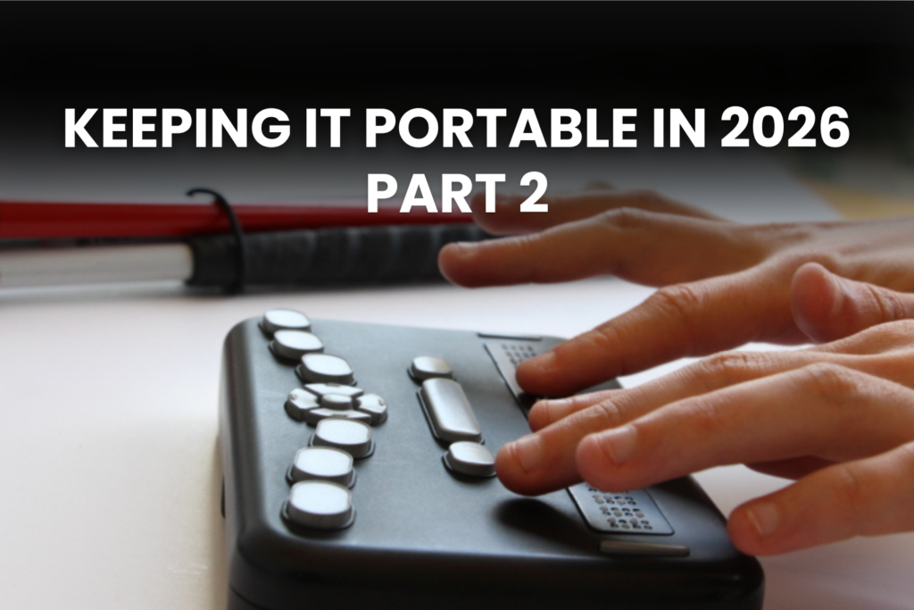
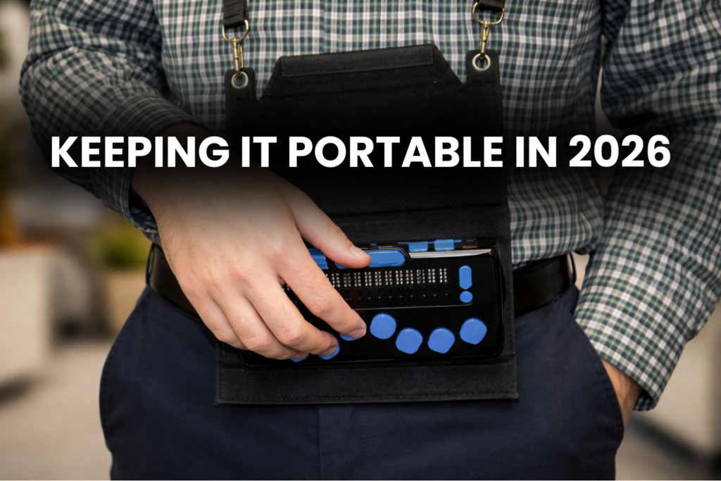
Braille display basics: What is a braille display?
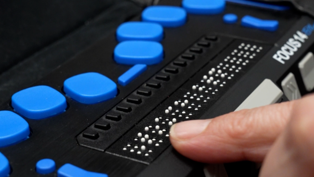
A braille display typically connects to a smartphone or computer via USB or Bluetooth. Pins are raised and lowered to create braille text. Braille displays, at least currently for the most part, function as one line and show a limited number of characters, or cells, at a time, generally ranging from 12 to 80 cells. While multiline displays are available, most users don’t have access to them yet.
Braille displays work with screen readers. One needs a screen reader running, such as Voiceover on an iPhone or Mac, JAWS, NVDA or Narrator on Windows, to use a braille display. The speech on the screen reader does not need to be active, but the screen reader program does.
What screen readers and braille have in common
Many best practices benefit both speech and braille users. Logical heading structure, links with clear names, meaningful alt text, form labels, and consistent navigation. These are fundamental aspects of accessibility for all users, including braille users. However, braille users have a different user experience than users accessing information by speech.
The narrow window of braille
As discussed above, a braille display typically shows a small number of characters at a time. This can range from 12 to 80, depending upon which braille display a user has. Since braille must be physically scrolled, carefully consider your labels. Since a user is limited by the length of the display, your word choice can impact the time that is needed to navigate through an interface.
Consider you have a combo box with several choices.
- Helen Keller Services info,
- Helen Keller Services fund raising,
- Helen Keller Services directory,
- Helen Keller Services fun facts
It is more time consuming for a braille user to have to read the same phrase over and over again before deciding on which to choose. This could also be arduous for a sighted user and a screen reader user accessing content through speech, but increases the work load for a braille user because they may have to physically scroll a button on their braille display to read all the content. A better choice in our example would be to remove the words “Helen Keller Services” from the choices within the combo box. Removing redundant text in this case also allows a Braille display user to navigate via first letter navigation, increasing their efficiency.
The same can be said for form field labels. Imagine you have a form, and you have a group of radio buttons. The radio buttons read: Select one: Apple, Select one: pair, Select one: banana. Since they are radio buttons, a screen reader user will know that they have to select between the choices, so the words select one only adds verbosity, which can slow both a screen reader and braille user down. This may become exhausting to a braille user.
Imagine you have an edit field and the label is: “Enter your name here.” While it may not take long to visually scan for this or listen with a screen reader, and while it’s not a lot to read in braille, it still adds extra time and takes up limited braille display real estate. So, when you’re designing, write concise, information-dense labels. Avoid redundant language and unnecessary verbosity.
Focus management
When focus jumps unexpectedly, this is jarring for all users. However, it may be even more disorienting to a braille user, as it takes more time to understand where your focus has moved if you only have 12 cells to work with. For example, imagine you are a braille user filling out a job application. You type your name, press Tab, type your email, Tab, and expect to continue smoothly through the form. The braille display refreshes and now you read: Job Application
Welcome to Our Company. You wonder what happened to the form? Unexpectedly, the focus moved to the top of the page instead of the next field. Now, you need to reorient yourself and find any error messages that may appear.
When you’re designing, make sure that the focus order is logical and predictable.
Dynamic content
Chat windows, and auto-updating pages may be more challenging for braille users to navigate. A speech user may hear the notification that a new chat message has arrived, for example, but a braille user might miss this message as it flashes across the braille display. For example, imagine you’re using a live chat feature to communicate with customer service. You’re typing a message with a question about a bill, and while you’re typing, a message from the agent comes in. For a brief moment, you feel your braille display change, and you wonder what happened to the message you were writing. Did it send before you finished? Then you feel the message you were typing again.
If the user is typing in the message box, leave the keyboard focus there. Implement a method for the user to jump to the latest messages.
Self-voicing applications, or interfaces that depend upon hearing and verbal interactions
If you’re developing an app for people who are blind, the first thing you might think of is audio. You might create an app, such as a game, that is self-voicing and does not rely on Voiceover or another screen reader. However, this does not allow your braille users and DeafBlind users access.
Another important consideration is interfaces that rely on hearing. If there is a sound that tells users to take action, or if they need to listen to speech, it is critical to ensure that there is an alternative way for someone who cannot access sound to be able to obtain the same information.
Transcripts
If you are designing a product that includes audio, like a training course, Transcripts are critical for DeafBlind users. Without a clean transcript that includes both visual and auditory information, a braille user won’t have access to the information. Designing audio-only interfaces excludes DeafBlind users and users who rely on braille to avoid speech fatigue or to maintain privacy and precision.
Include braille users in testing
When you are developing a product, include braille users in the testing process. If you’re already aware of accessibility, you might already include screen reader users who access content via the text-to-speech output of their screen reader, but braille users will have a different experience and give you feedback that audio-only users may not provide.
Conclusion
This article provided an overview of recommendations to keep in mind so that your content is more accessible to braille users. This article does not represent the experience of all braille users, but serves as a general overview. Braille is often treated as a feature of a screen reader rather than a primary access modality. This is why it is critical for accessibility teams to include testers who use braille. When you’re designing, keeping in mind that a braille user typically can only view a small set of characters at a time and asking yourself whether you can access the information without sound can help you create more accessible content. Don’t assume that an interface will function the same for a speech user as for a braille user. Until braille users are included in every step of the design process, developers are missing out on building good user experiences that work for everyone. Accessibility is about making sure all users, regardless of how they interact with content, can work efficiently, privately and with dignity.