7 Common Accessibility Errors On Websites and How to Fix Them
Learn about the most common accessibility errors on websites and how to improve them to build better website pages or call out issues on existing websites.

By Aliana Manteria, Megan Dausch (Accessibility Specialist), Matthew Salaverry, and Tara Brown-Ogilvie (Accessibility Specialist), Helen Keller Services
May 18, 2023
Accessibility affects everyone: individuals who are DeafBlind, people with combined vision and hearing loss, people with varying ranges of vision and hearing loss, those with other disabilities, and people with full range of sight and hearing. But oftentimes, websites implement (or fail to implement) elements on their pages that make websites inaccessible to all audiences. This makes it difficult for people to navigate a website smoothly and can even result in a lawsuit.
The Global Accessibility Awareness Day home page shares that according to a 2020 WebAIM analysis of one million web pages, 98.1% of home pages had at least one WCAG 2.0 failure and there were an average of 60.9 errors per home page. WCAG stands for “Web Content Accessibility Guidelines.” The causes of most common accessibility failures are from low contrast text, missing image alt text, empty links, missing input form labels, empty buttons, and missing document language.
You have likely browsed websites or even host a website that has a number of accessibility errors. Whether you’re a developer, designer, or a regular Internet user, you have the power to make digital spaces more accessible.
Here, we break down 7 common digital accessibility errors and how to make improvements to them to make all websites more accessible.
- Low Contrast Text
- Missing Image Alternative Text
- Empty Links / Missing Link text
- Unclear Link Language
- Empty Buttons
- Missing Form Input Labels
- Missing Document Language
1. Low Contrast Text
Low contrast on websites shows up when there is not adequate differentiation between colors on a page. For example, a light-colored text on a light background has poor contrast, and is likely difficult or even impossible to read, regardless of your level of vision. Poor color contrast can affect anyone, whether someone has vision loss, is blind, is color blind, or has near perfect vision.
One way to improve low contrast on your website is by increasing contrast between text and background through a contrast checker so content on your website is more legible. According to the Web Content Accessibility Guidelines version 2.2, you must have a contrast ratio of at least 4:5:1 to be AA compliant. You can achieve this ratio by using the contrast checker tool to compare the colors you plan to use to see if they meet accessibility standards and reach the required contrast ratio.
You can also improve color contrast by testing webpages with people across the visual spectrum to get their direct feedback on color combination choices and to gauge the level of comfort people feel while reading information on a website.
2. Missing Image Alternative Text
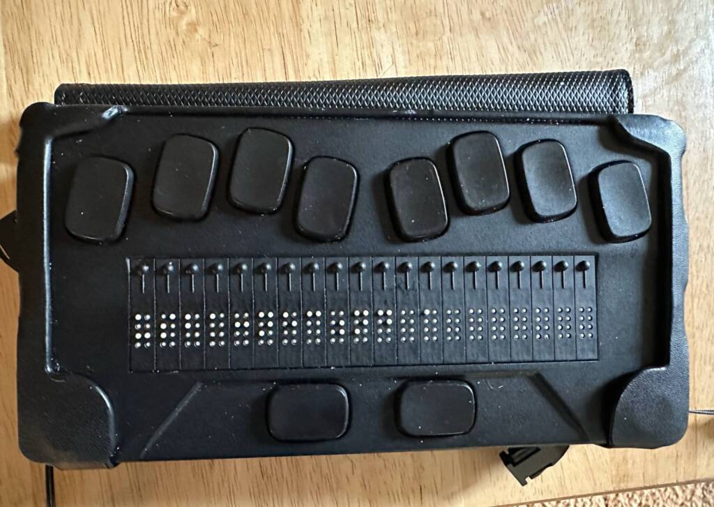
Alternative text (or “alt text” for short) is descriptive text that describes non-text content, such as images. People who are DeafBlind, blind or have low vision may use assistive technology to access digital content. Examples of assistive technology include screen readers (which read content out loud), screen magnifiers (which enlarge text), and braille displays.
When alt text is missing from an image, assistive technology users and screen reader users will not receive the same information as sighted users, and may not have any way of knowing what’s in the image. They may try to rely on the image URL or the image’s file name, which may read as something unspecific like “pic.jpg.” This information does not provide meaningful information for screen reader users, which makes it inaccessible. Missing alt text can also affect people who can view their screens too, because if their Internet connection is weak and they’re unable to load an image, they will see the alt text. Another reason to make sure alt text is present!
One way to improve missing alt text on a website is by writing descriptive, relevant, and concise descriptions of the contents of images on a website and adding that alt text into the code. It is best to write about the main ideas of what’s happening in an image within the context of the web page, and best to avoid describing irrelevant information that doesn’t pertain to the main idea.
Let’s say there is an image of people on a website that’s advertising a relay event. Depending on the context, it may be best to describe the alt text by saying something like this: “a group of smiling people standing outside and wearing relay t-shirts.” Don’t add irrelevant details to the alt text, such as describing peoples’ shoelaces or the brands of watches on their arms, as that’s irrelevant to the purpose of the relay photo being on a page. Make sure the details added to the alt text are true to what’s happening in the image and not deceptive, too. Learn more about writing alt text here.
By understanding the foundations of alt text and implementing it in photos on your website, you will give users who use assistive technology the opportunity to access images on your website and provide blind people and individuals with low vision with a well-informed user experience.
If you want to find out if other websites lack alt text in photos to bring this topic to website administrators’ attention, you can right click on the image (or select “Control-Shift-I” on keyboard) and then select “inspect” it to see if alt text is in the code.
3. Empty Links / Missing Link Text
Links perform an action on a web page and will redirect you to a new page or to a different section within the same page.
Empty links are links that do not have text anchored to them. You can find this neglected on many websites, such as on social media icons that link to social media websites. If the social media icon does not have text assigned to it describing the icon, those who use assistive technology won’t know what the link leads to.
One way to improve missing link text, according to this Empty Link article by Equalize Digital, is by adding an aria attribute to the <a> tag in the website’s code so people using assistive technology can have access to the name of the link or icon.
It’s also important for developers to think about the purpose of links and use the correct HTML to achieve that. This will make for a better user experience for those who access the web via keyboard and assistive technology.
4. Unclear Link Language
Links need to have phrases attached to them that convey context of where the link will lead to. People who use screen readers have the ability to tab through links on a page, so they have the ability to skim through the names of several links. The issue begins when a screen reader reads a link list and it says things like “click read,” “read more,” and “start now.” This link language is unclear when read out of context.
One way of improving link language is by using specific and concise language that identifies the subject matter of the link, such as naming the links with phrases like “read the salad recipe,” “read more about dressings,” and “start nutrition course” as opposed to unclear phrases like “read more.” Doing this helps everyone — those who use screen readers, those use braille displays, those who can see and are skimming web pages fast — better understand where links will lead and aids in a better and more accessible user experience.
5. Empty Buttons
A button on a website performs an action on a web page you are currently on. According to this a11y-101 article, buttons are used to submit a form, open a layer or menu, close a layer, or close a pop-up. A pop-up layers over the existing web page. For example, when you enter a clothing store website, a pop-up will usually appear on the page a few seconds later that says something like “Get 10% off on your next purchase – just input your email address!” Usually beneath that copy there will be buttons on the pop-up that say something like “Give me 10% Off” or “No I don’t want to save.” When you select either button, the button will perform the action it’s linked to.
When a button in a form, menu, layer, or pop-up is empty, it can create obstacles for people who use assistive technology. It can prohibit people from accessing the information on the button, as they may not know what the information on the button is supposed to say.
One way to improve empty buttons is by working with elements. According to this Empty Button article by Equalize Digital, “You will need to either: add text content within an empty <button> element, add a value attribute to an <input> that is missing one, or add alternative text to a button image.” This will allow screen reader users to access the information in buttons. Overall, it’s important to make sure that buttons (as well as links) are coded correctly to prevent complicating the user experience for people who use assistive technology.
6. Missing Form Input Labels
A form is used on a website to collect information from a user, such as an email address or credit card details. Without labels on a form, a person will not understand what the form is asking for and it can cause people confusion or hesitation with filling out the form. A person may attempt to fill out the form, but without labels, they may not know where to input their name, address, or other important information that is typically listed in forms, which results in an action that’s potentially not taken.
One way to improve missing input labels on a website is by making the form field have “a visible label inside a <label> element” according to a Practical eCommerce article. Doing this will help people have a smoother and more accessible user experience while filling out forms.
7. Missing Document Language
The language used on a website needs to be specified so people who use screen readers can listen to a voice say the content in the correct pronunciation of the language.
One way to improve missing document language is by using the HTML lang attribute in the back end of the website, such as <html lang=”en”> for English or <html lang=”es”> for Spanish. This will make information on websites more accessible for screen reader users. Learn more about the HTML lang attribute here.

Conclusion
At Helen Keller Services, we strive to make our website as accessible as possible to all audiences. We hope you can use this article as a motivator to take action on your own website, or to contact companies with inaccessible websites and ask them to make changes that will ultimately make digital content more accessible for everyone.
It’s imperative to implement best accessibility practices and to include people with disabilities in every step of a website project to show your commitment to accessibility. As an organization that works with DeafBlind, blind, and low vision individuals, we take pride in creating and fostering both physical and digital accessible environments.
If you’d like to learn more about our mission, visit helenkeller.org. If you’d like to learn more about how we practice digital accessibility, visit our Accessibility Statement page.
If you have questions about this article, contact help@helenkeller.org.


